interior design
2024
Port
folio
Port
folio
Zakiyya oomra
S
zakiyyasoomra@gmail.com
076 757 0749


RECEPTION
WAITING AREA
WAITING AREA
asphen studio’s
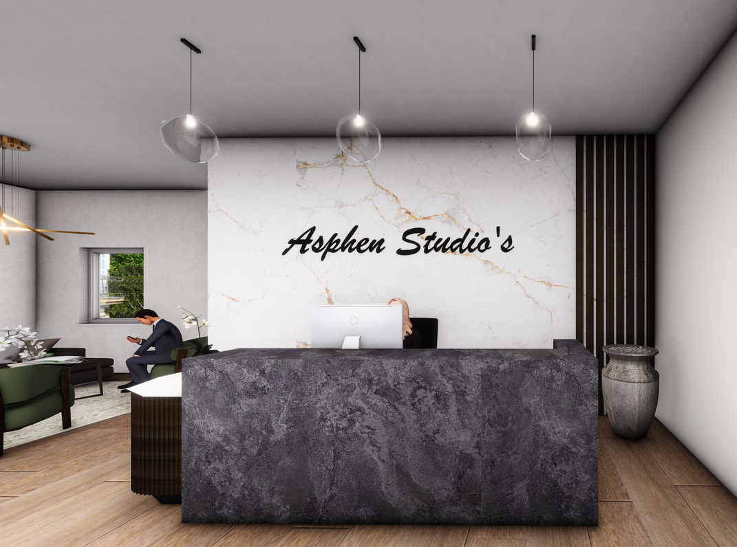
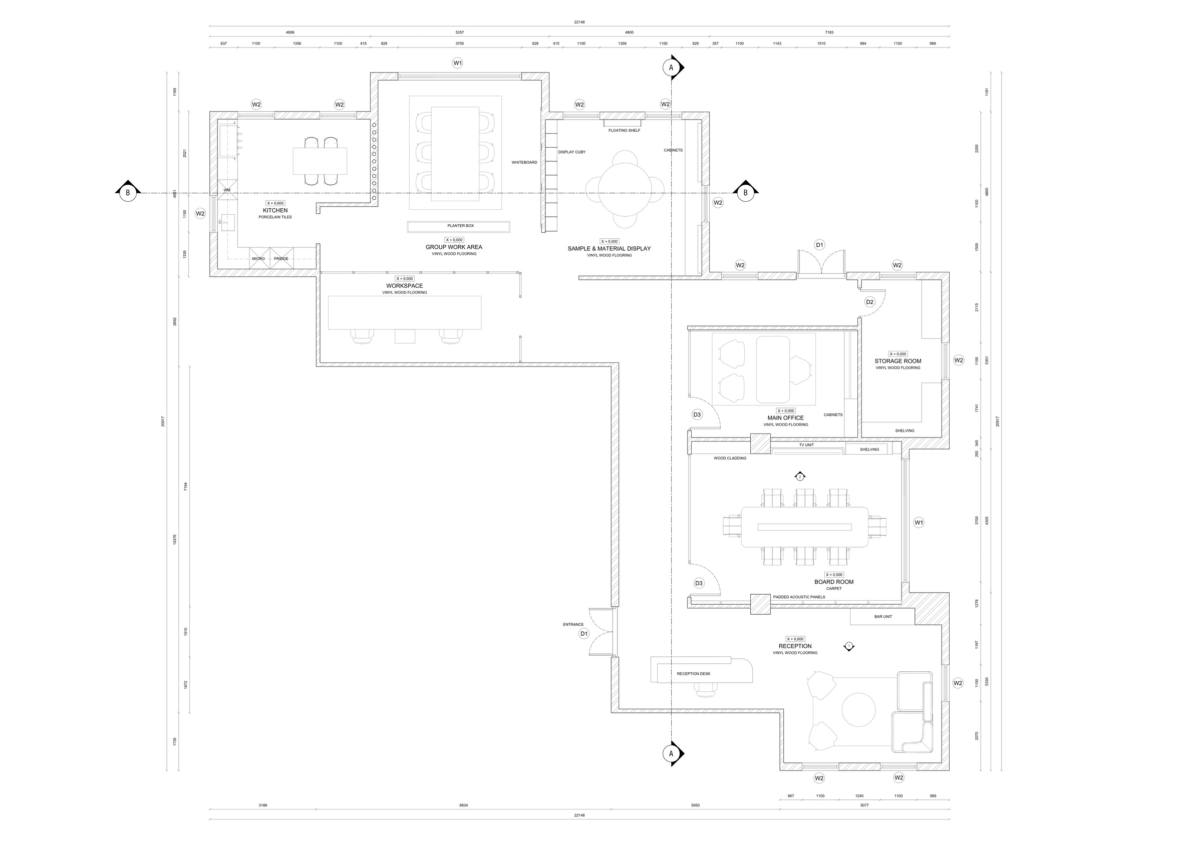
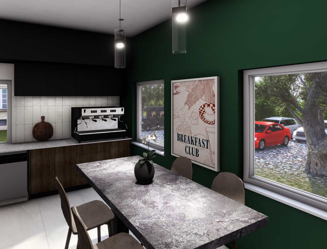
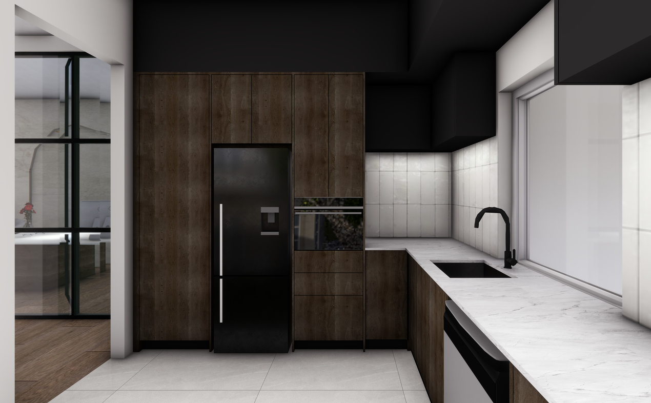
For this design, I was tasked with creating an office space for a personal brand. In this instance, “Asphen Studio’s” was created.
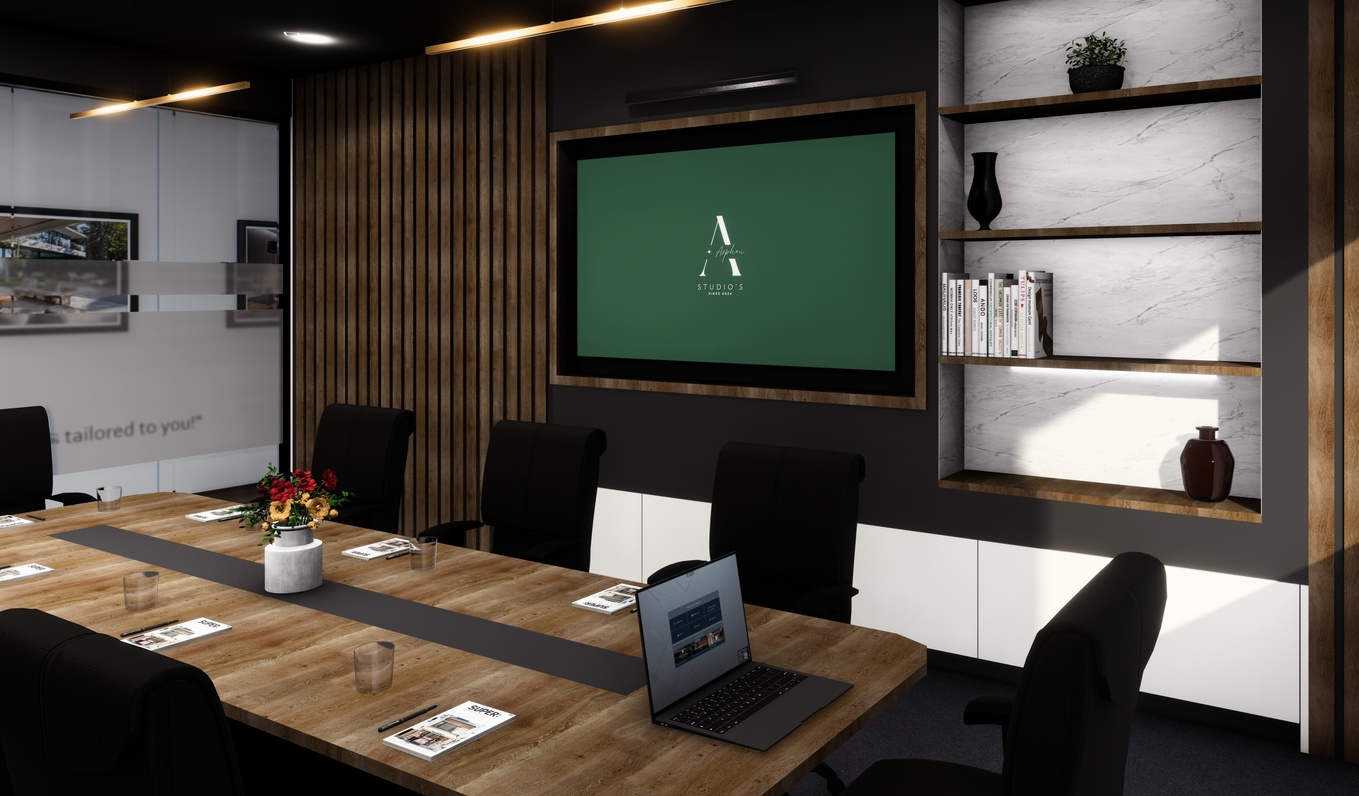
The workplace design for Asphen Studio's is a testament to the brand's core values of sophistication, timelessness, and creativity. The design palette, predominantly featuring emerald green and light beige and white, have been meticulously chosen to convey a sense of elegance and creativity, setting the tone for a refined and inspiring workspace.
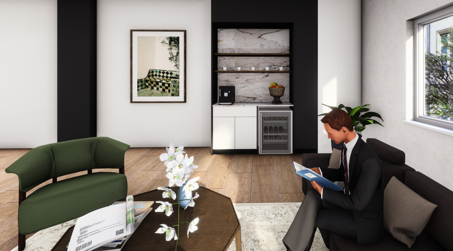
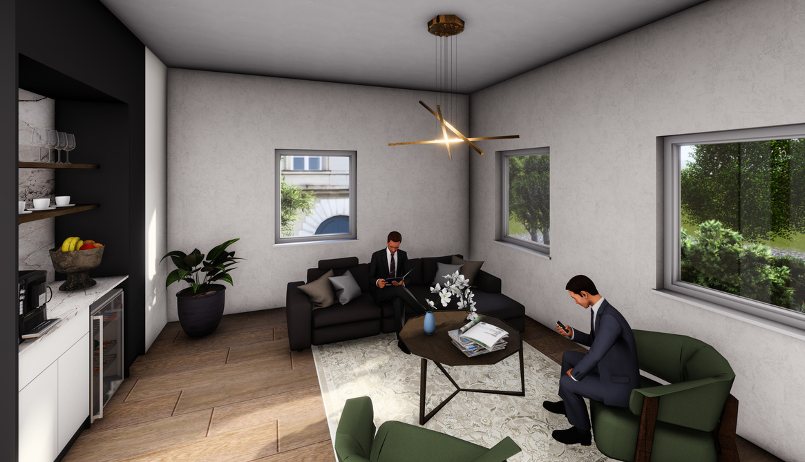
The reception and waiting area serve as the first point of contact for visitors, making it crucial to create a lasting impression that aligns with the brand's image. Here, wood flooring is complemented by emerald green accents in the furniture, evoking a sense of opulence and grandeur. The use of soft, welcoming lighting further enhances the space, ensuring that guests feel instantly at ease upon arrival.
02
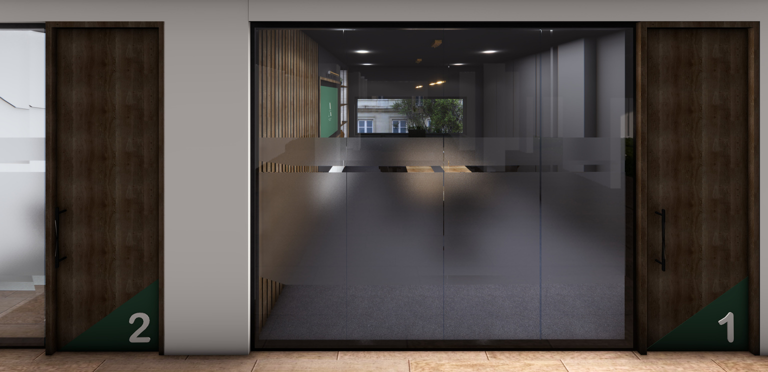
Glass partitions in the workplace design offers a blend of privacy and openness, maintaining the sophisticated aesthetic while providing functional benefits. They enhance the modern look, allow natural light, offer spatial flexibility, provide privacy without isolation, and acoustic benefits.
PRIVATE MEETING ROOMS
BOARDROOM
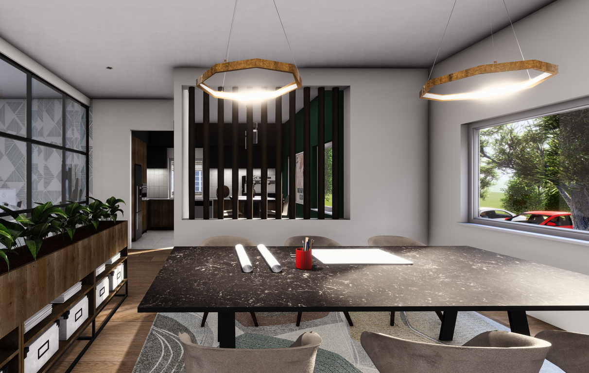
The choice of materials such as marble, stone, and wood play a pivotal role in defining the overall aesthetic of the workplace. Marble, with its timeless appeal and association with luxury, is used in key areas like the reception and material library, adding a sense of sophistication to these spaces. Stone finishes are incorporated to add texture and warmth, while wood accents throughout the workplace bring a sense of nature indoors, creating a harmonious and inviting atmosphere.
GROUP WORKING SPACE
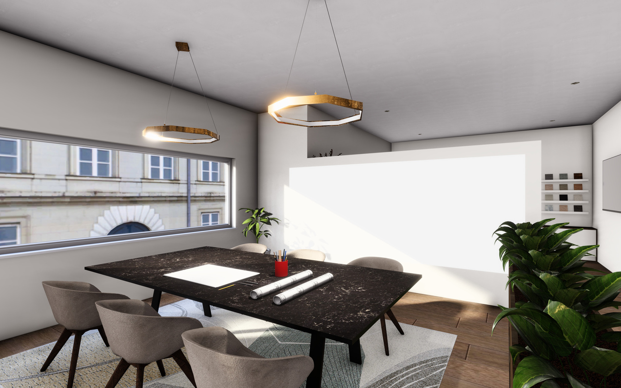
GROUP WORKING SPACE
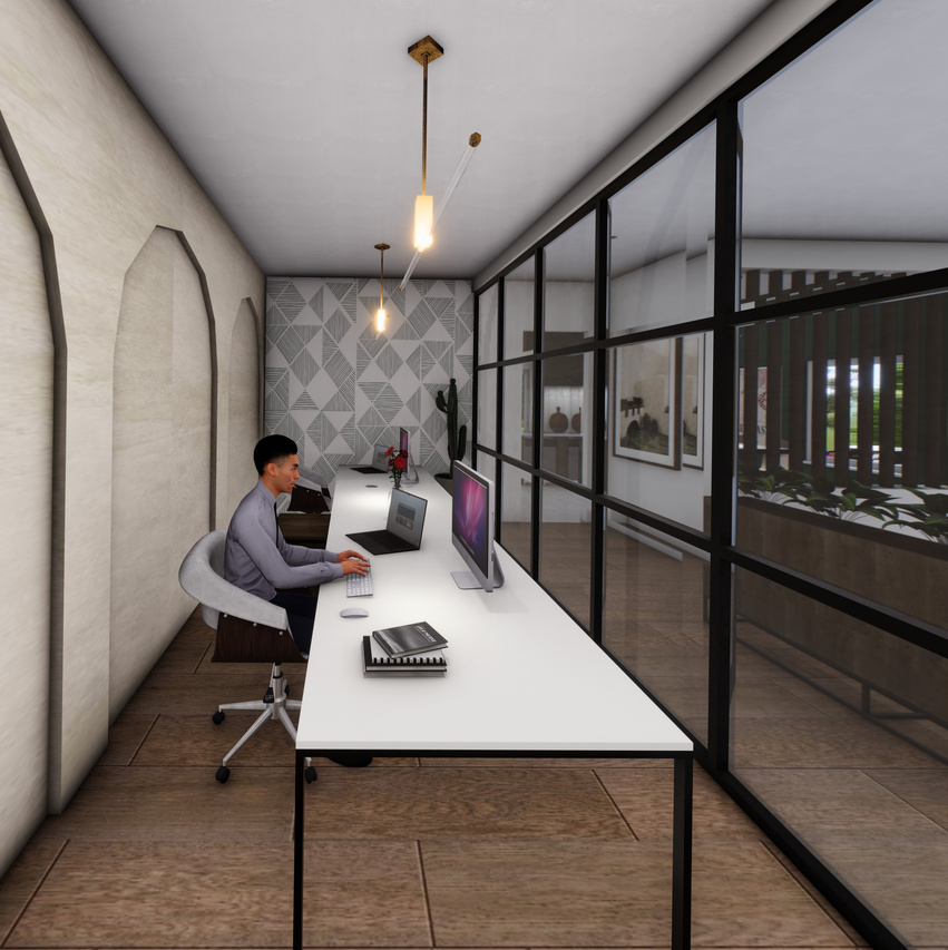
INDIVIDUAL WORKING SPACE
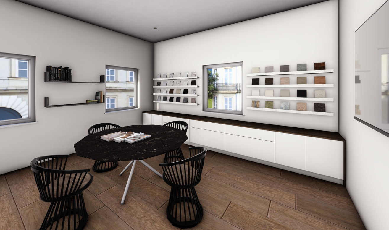
MATERIAL AND SAMPLE LIBRARY
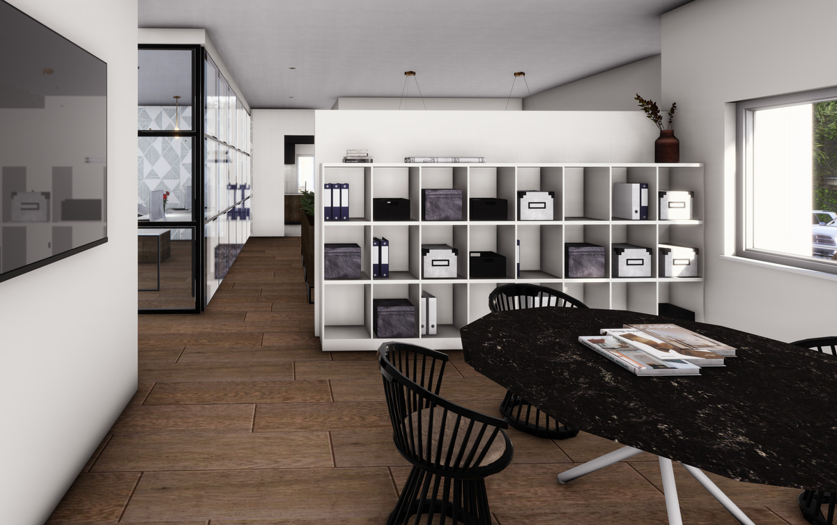
MATERIAL AND SAMPLE LIBRARY
KITCHENETTE
KITCHENETTE
03
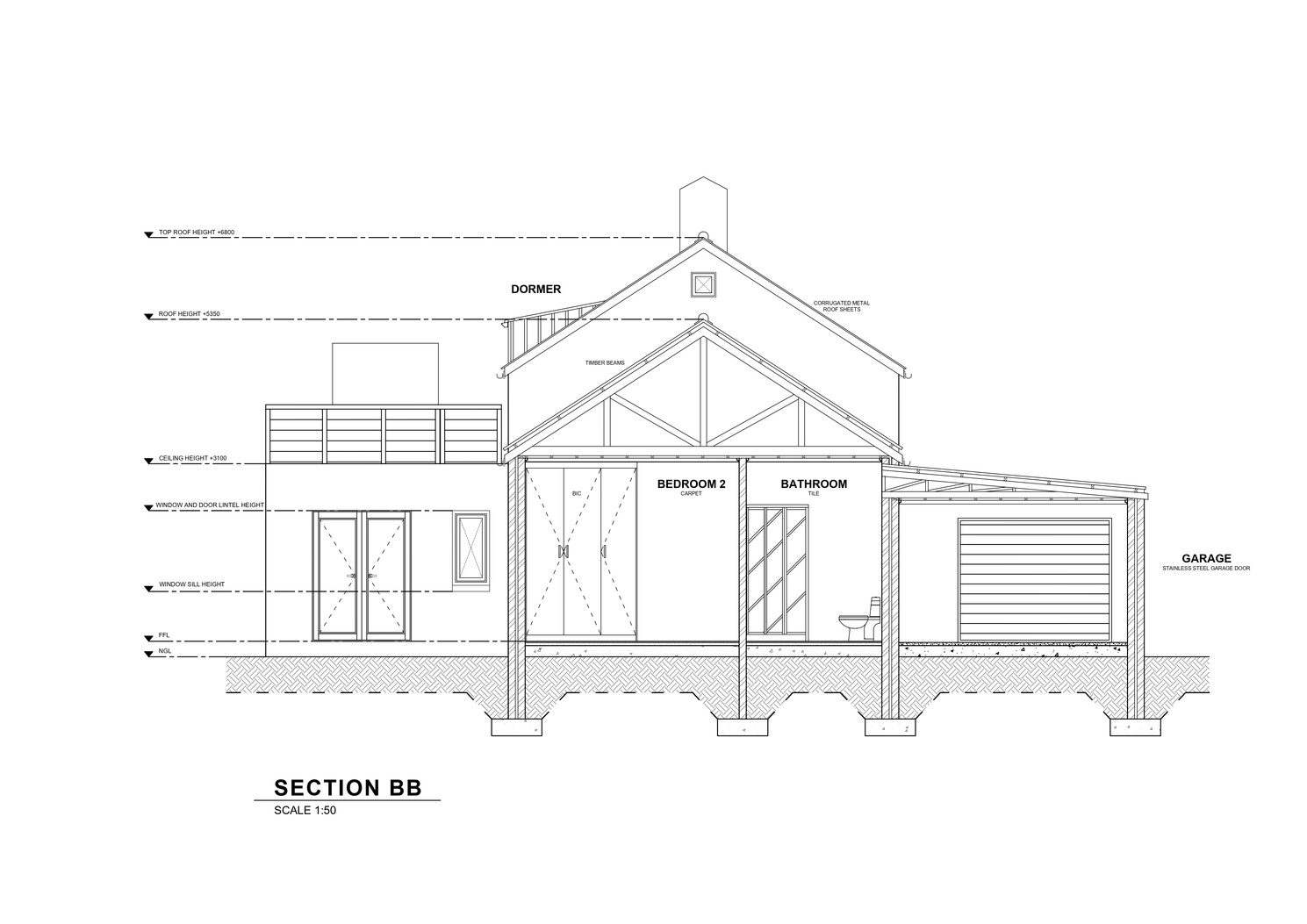
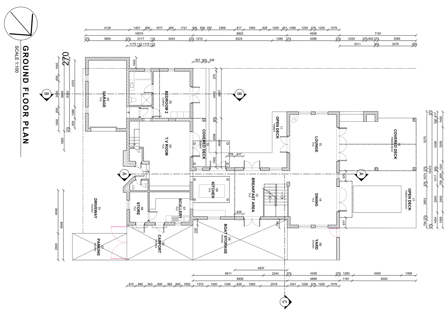
COASTAL HOUSE
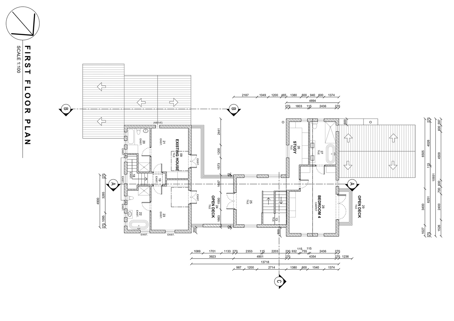
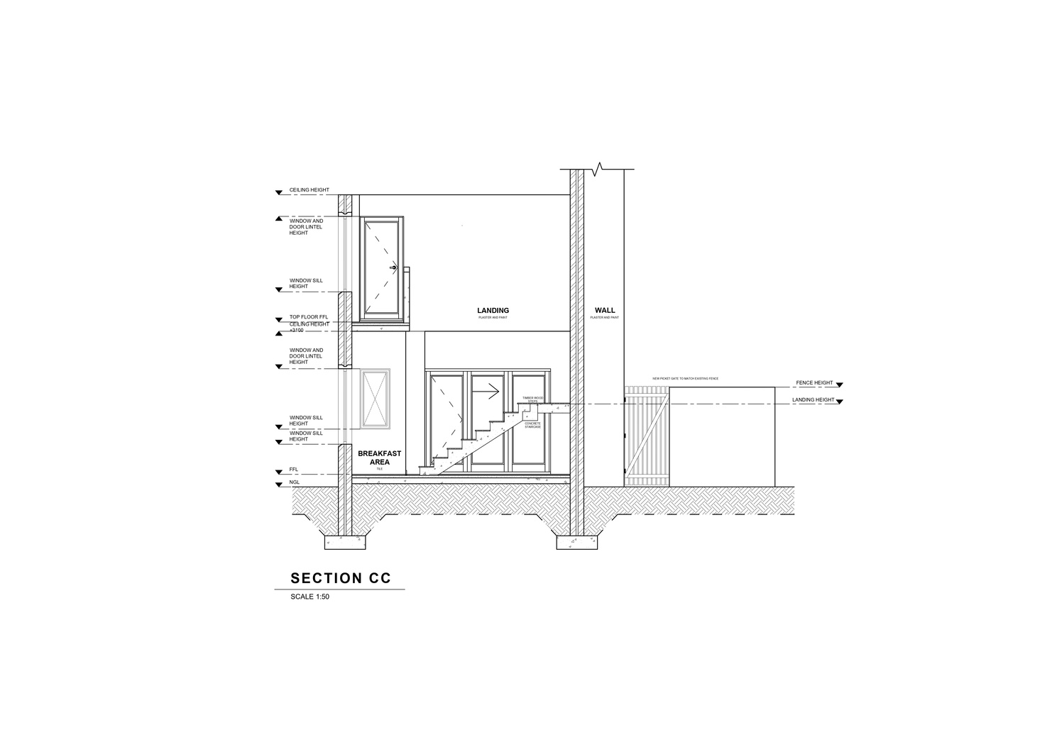
TECHNICAL DRAWINGS
Completed in my second year. The goal of this assignment was to feature our technical drawing skills and application on AutoCAD
04
kitchen design
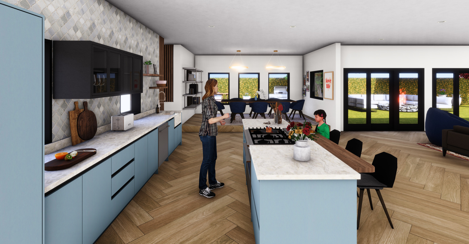
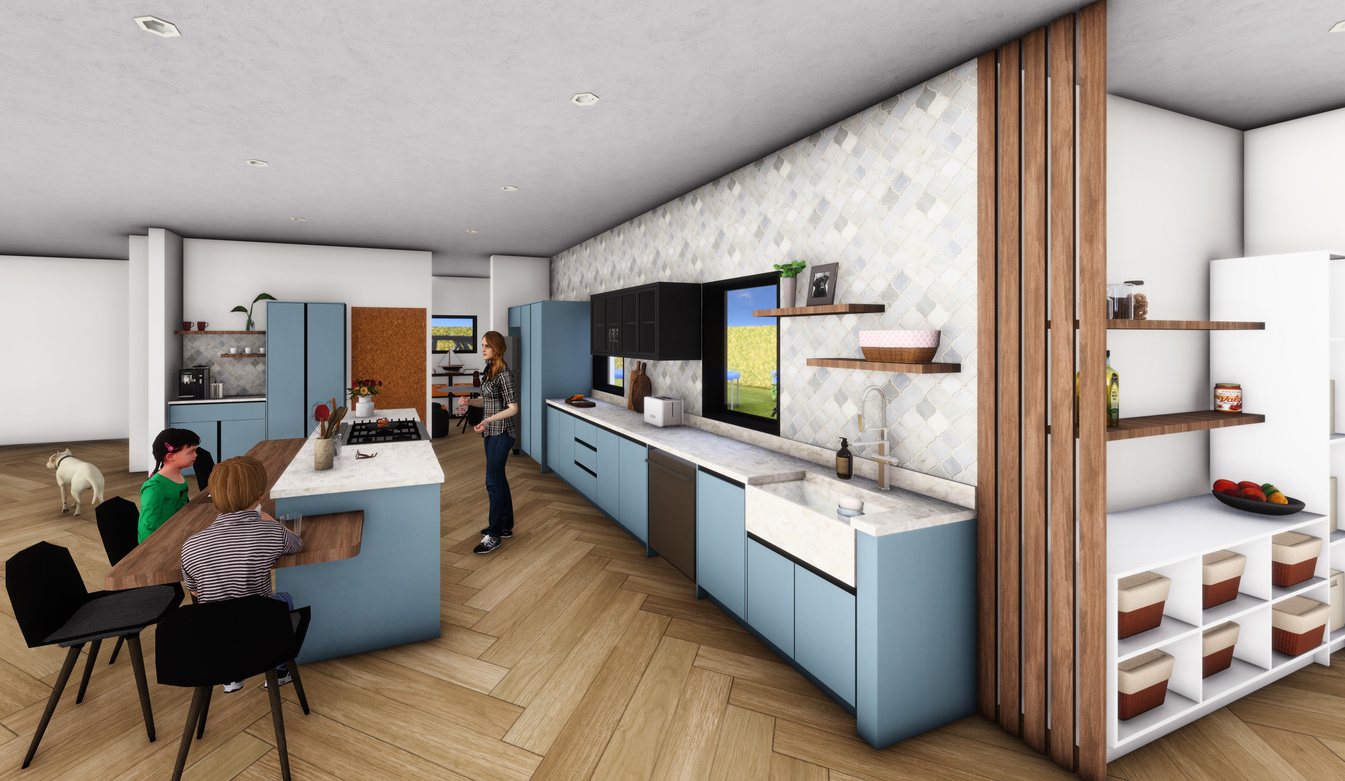
This kitchen in was designed with a contemporary country aesthetic for a widowed mother of four. It prioritises functionality, comfort and a warm and inviting atmosphere. This design also ensures optimal comfort and accessibility for a left-handed user. The design embraces the warmth and authenticity of a country aesthetic by natural materials, earthy tones, and rustic textures. Given the family's size, the kitchen will serve as the heart of the home, encouraging quality family time and interaction.
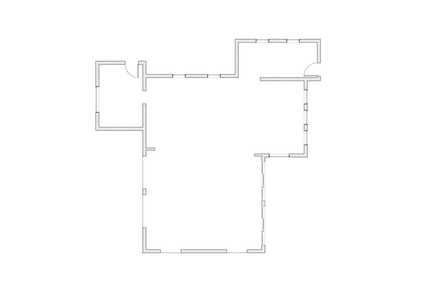
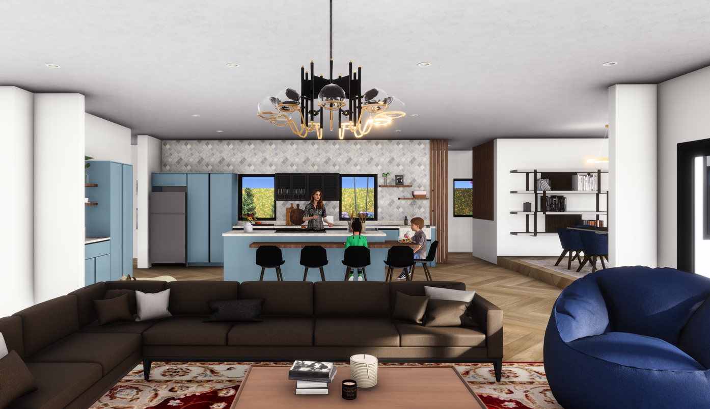
An open-concept layout that integrates the kitchen with a dining area or an adjacent family room allows for easy movement between spaces. This space features 5 main areas: the kitchen and dining space, living and entertainment room, a mud, and craft room, and lastly the pantry and office space. The mom, Gladice works from home, so it was important that her home office is close and accessible to the main kitchen area.
The children love arts and crafts and freedom of movement. The intention behind this design was to create a space that Gladice and her children can use freely and independently. Multiple counter and seating spaces allows them to pick a space according to their activity. It also allows the space to be adapted according to their needs.
Certain design choices were made to consider child safety in the kitchen. Handles were removed from the design to prevent any injury that could be caused by a child running around the kitchen. Finger recesses were used instead. The kitchen nook has rounded edges – also to prevent injury. The microwave is placed below the counter so that it is accessible to the children and most cabinets are at counter height so that the children can access anything in the kitchen without assistance. The kitchen nook is designed at a height below the counter so that the younger kids would not have an issue getting up on the chair.
It was crucial that Gladice can keep an eye on her children while she goes about her day. For that reason, the retro cooker was placed on the kitchen island instead of against a wall. This allows Gladice to supervise her children while she cooks without having to keep turning back to face the stove. It also makes making meals a joint family activity as everyone can be seated around the table. The pantry area is sectioned into two with a divider. The second part of the space is Gladice’s home office. The divider gives her privacy while she works but also allows her to keep an eye on her children should they be in the kitchen.
ksa student competition
Although I did not place in the top 5 for this student competition, I was awarded with a special mention for my design and an offer to do a 4 week internship with Interior Fusion Kitchen Design Studio which I completed in Jan-Feb 2024 (I have since made changes to this design based on the feedback I received from KSA)
PANTRY
STUDY
PREP AREA
COFFEE STATION
ELEVATED
KITCHEN
DINING
AREA
ISLAND AND NOOK SEATING
LIVING ROOM
MUDROOM
DROP AND GO
AREA
KITCHEN
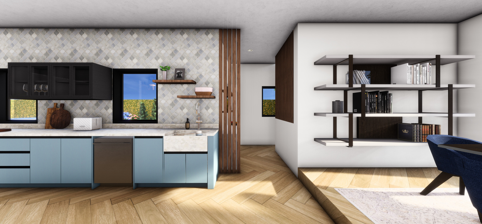
KITCHEN AND ELEVATED DINING AREA
05
OPEN PLAN LAYOUT
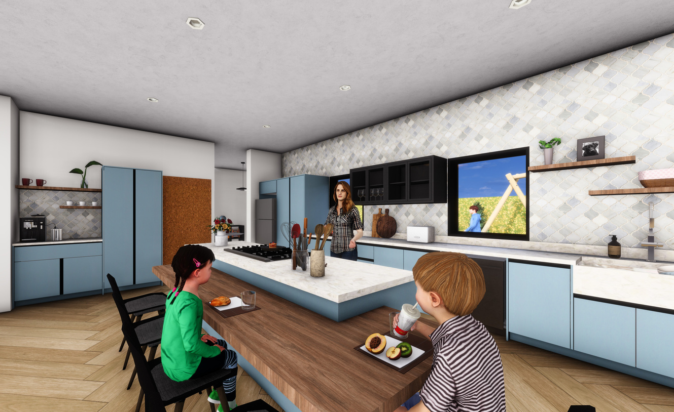
COFFEE AREA AND KITCHEN ISLAND
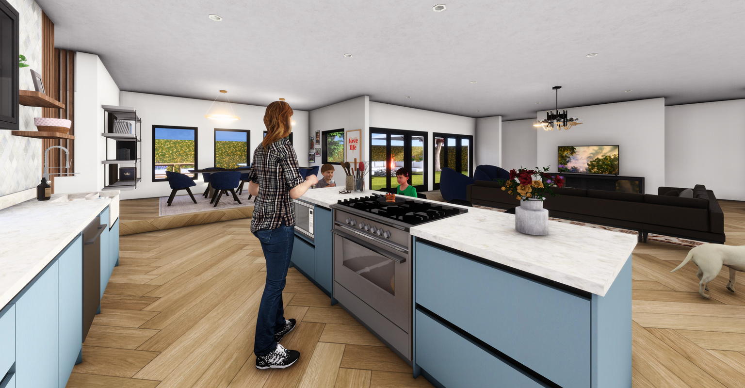
KITCHEN
KITCHEN AND OPEN PANTRY
The pantry is purposefully designed with no doors. An open pantry suits the family’s needs better as they can help themselves to any items in the pantry. Wicker baskets are used to organise groceries and vegetables. The baskets also allow everything to stay neat and tidy. It also follows a simple organisational method that the children would be able to maintain. The dishwasher and sink were also placed close to the pantry and dining table to make it easy for the children to put their dishes away when they are done. A large farmhouse sink is integrated into the countertop using the counters sapien stone material. The large sink is perfect for multiple dishes, pots, pans and trays and it fits the contemporary country aesthetic. Soft close runners and hingers are also installed in the kitchen for easy use.
Recognizing the user's left-handed preference, the kitchen layout is designed for maximum functionality and ease of use. The arrangement of work zones, appliances, and storage will accommodate left-handed tasks, ensuring effortless movement throughout the space. A triangle layout facilitates efficient movement in the kitchen. the sink is placed on the right so that the mom has plenty of space on the left to use for dishes. Majority of the counterspace is also on the left-hand side. Drawers are located on the left-hand side of the island for easy access.
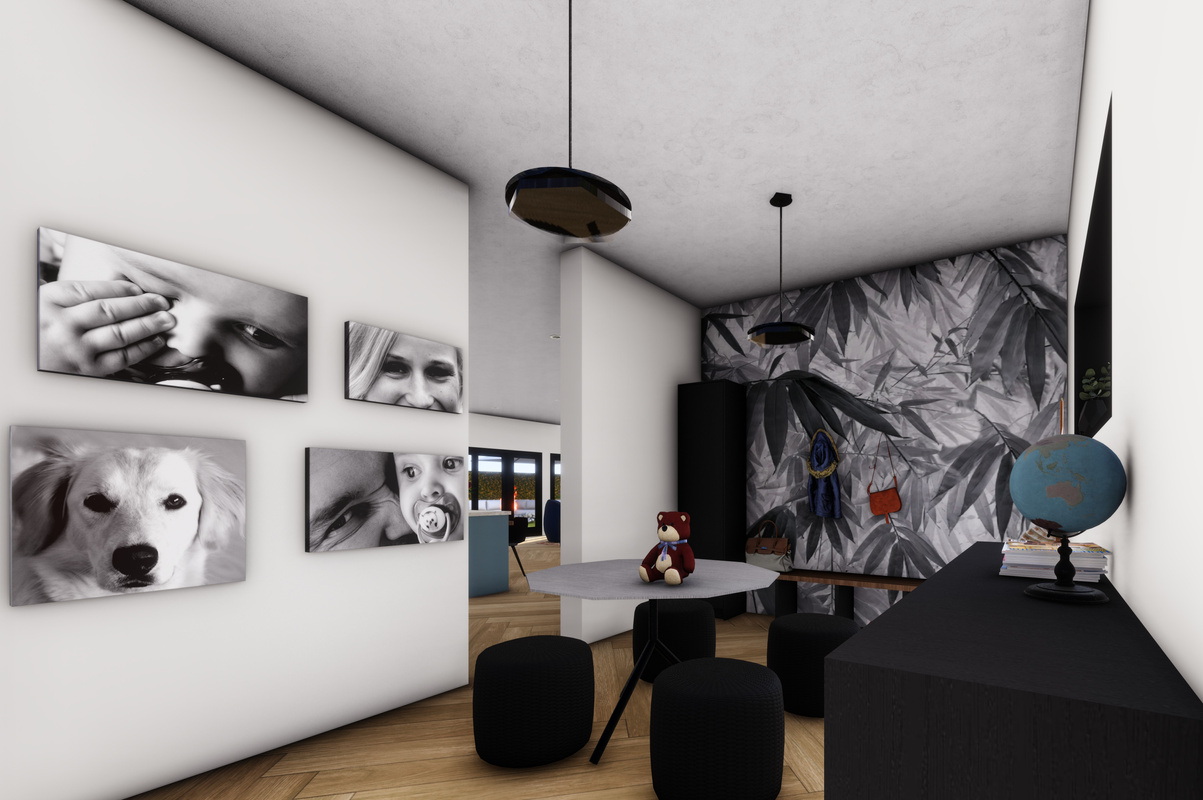
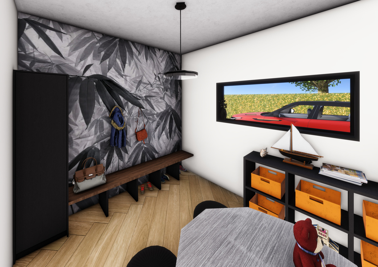
The mudroom is a multifunctional space. There are cubies with baskets which can be used for storage of art tools and equipment. The hooks on the adjacent wall are perfect as a drop and go area when they return from school or outings.
Ample and well-organized storage solutions are integrated to cater to the family's needs. Glass cabinets above the counter allow her to store more delicate items as display without worrying about her children reaching them. Gladice also has a dedicated coffee bar. Being a mom of 4 means there will always be a need for coffee in the morning. There is also a cork board on the wall closest to the mudroom. Gladice uses this board to keep track of important dates and to keep her family organised.
MUDROOM
MUDROOM
Natural materials such as wood and stone work well to create a seamless contemporary theme in the kitchen. It also adds a sense of history and elegance to the space. Soft neutrals create a calming atmosphere and complements rustic elements. Stainless steel and black appliances were chosen to complement the elements in the kitchen. The kitchen island and nook are used as a functional workspace and gathering spot. Arabesque tile backsplash was chosen to keep with a country aesthetic.
06
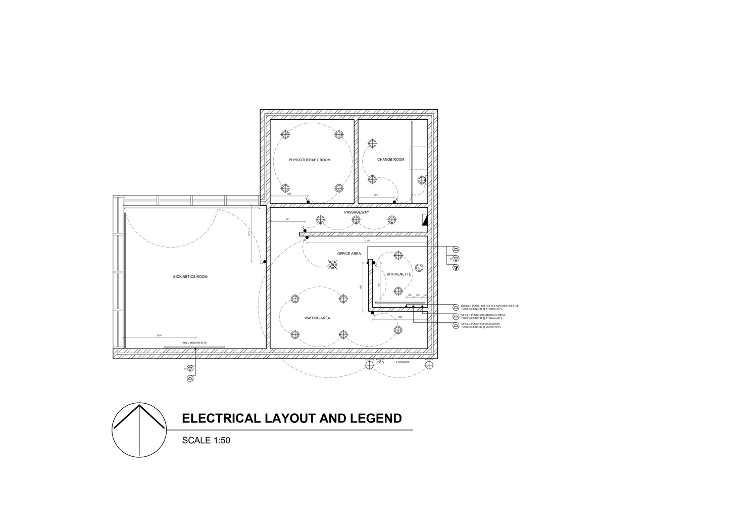
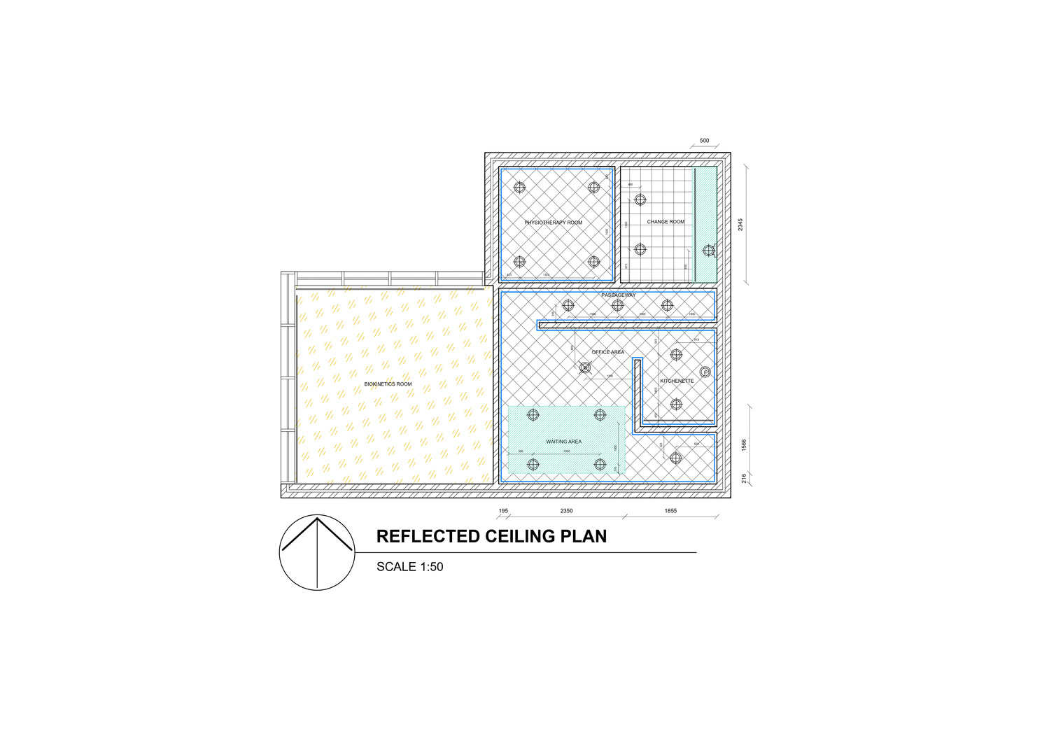
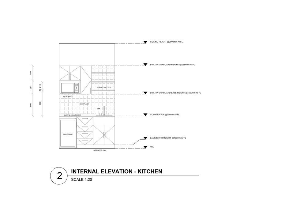
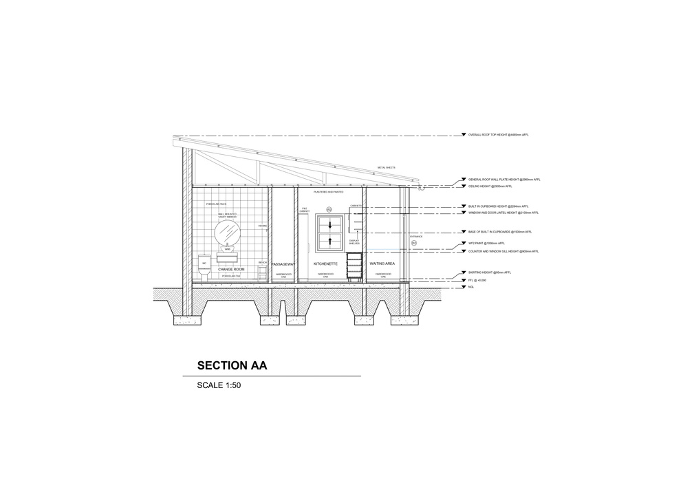
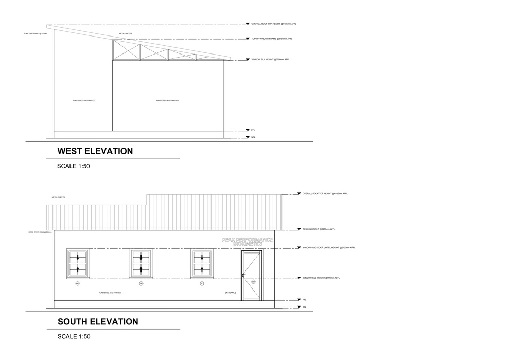
PEAK PERFORMANCE BIOKINETICS
TECHNICAL DRAWINGS

07
GILLITTS BED AND BREAKFAST
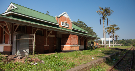
OLD GILLITTS TRAIN STATION REMODEL
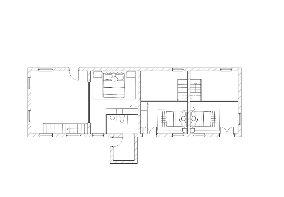
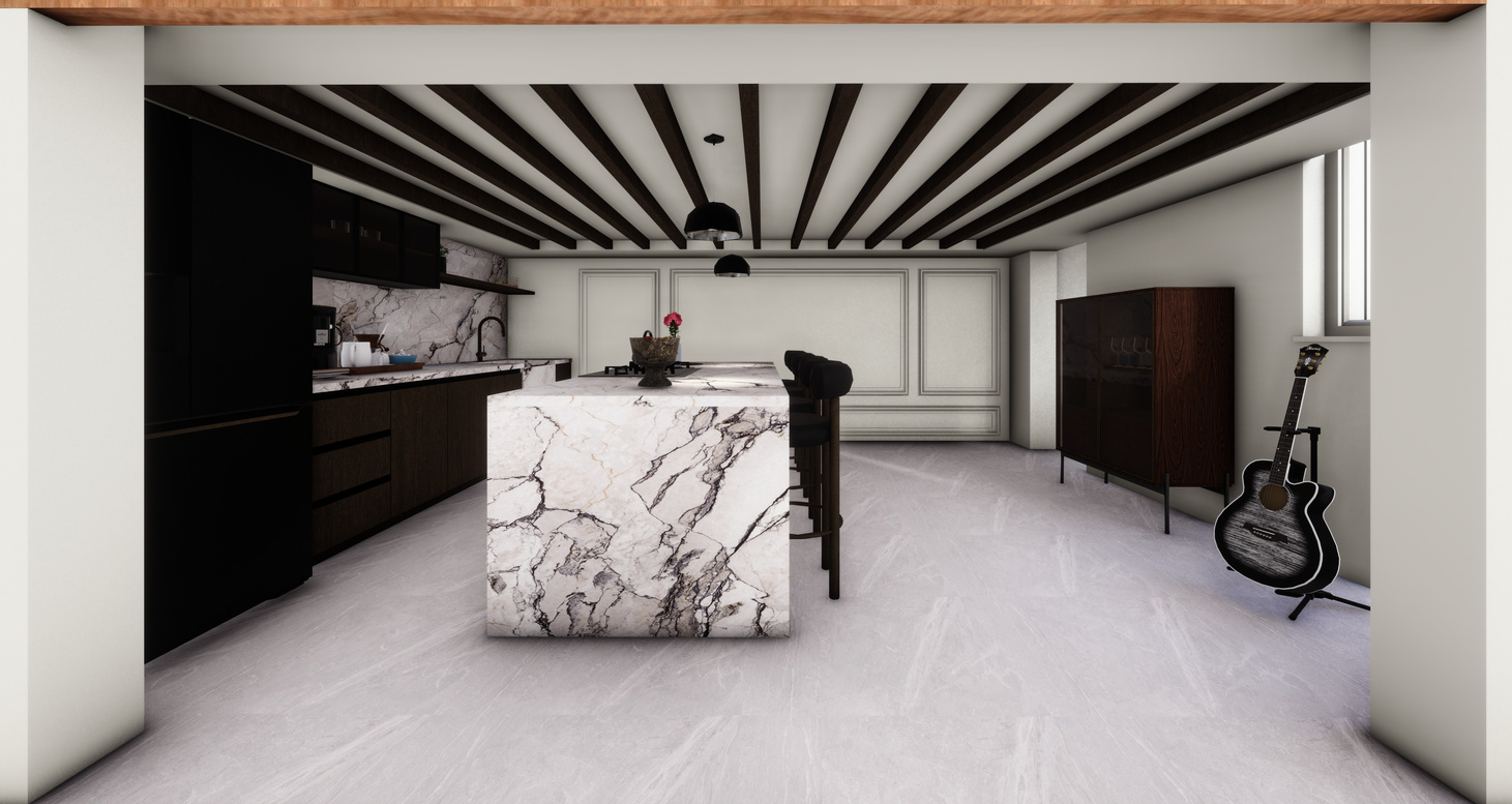
The design goal for this project was to repurpose a building for a modern function while respecting its historical significance. The Gillitts Train Station is currently not in use and the client has decided to renovate it into a residential home as well as an Airbnb for 2 additional guests. There needed to be both private and public spaces. The site itself is big enough as a residential home, however once you add the additional guests space becomes a constraint.
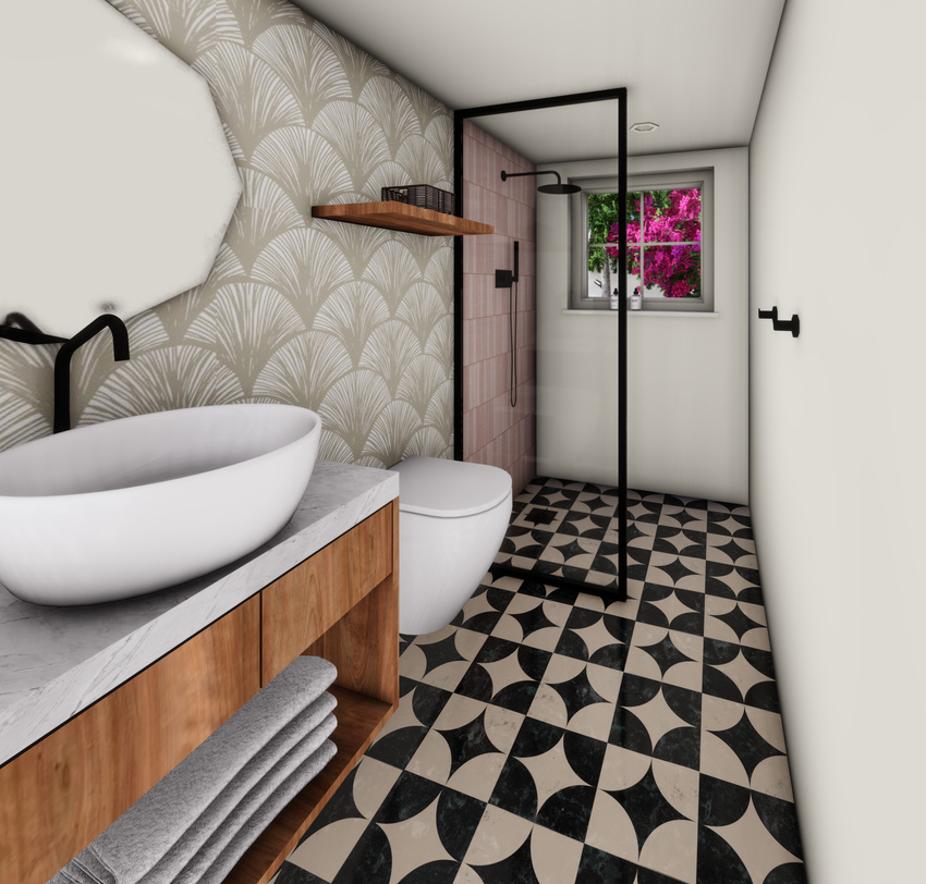
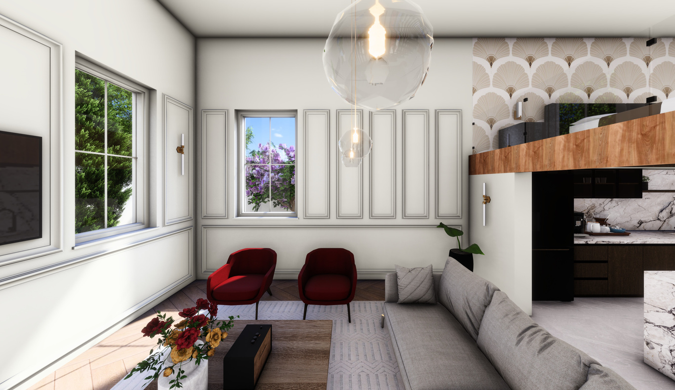
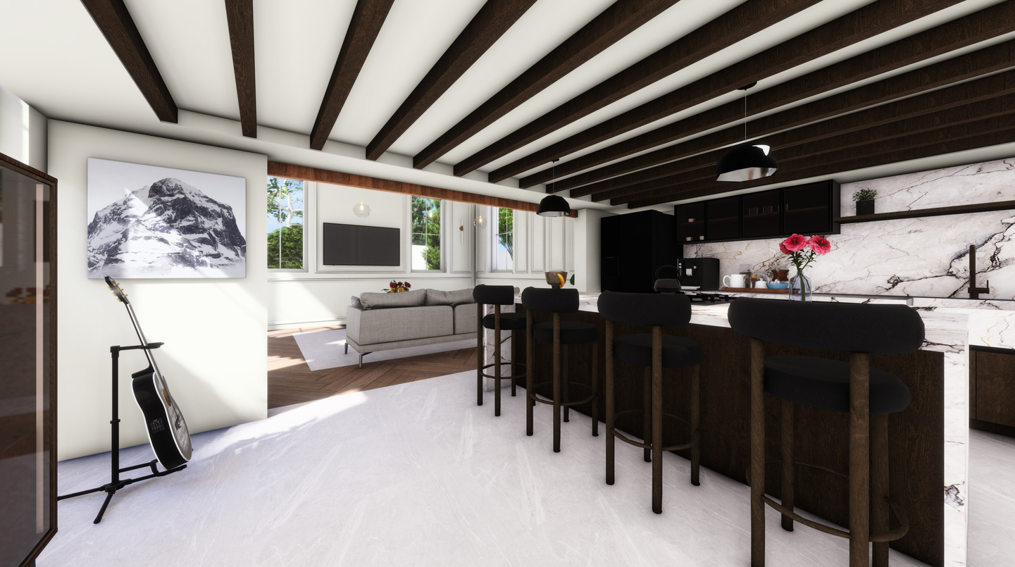
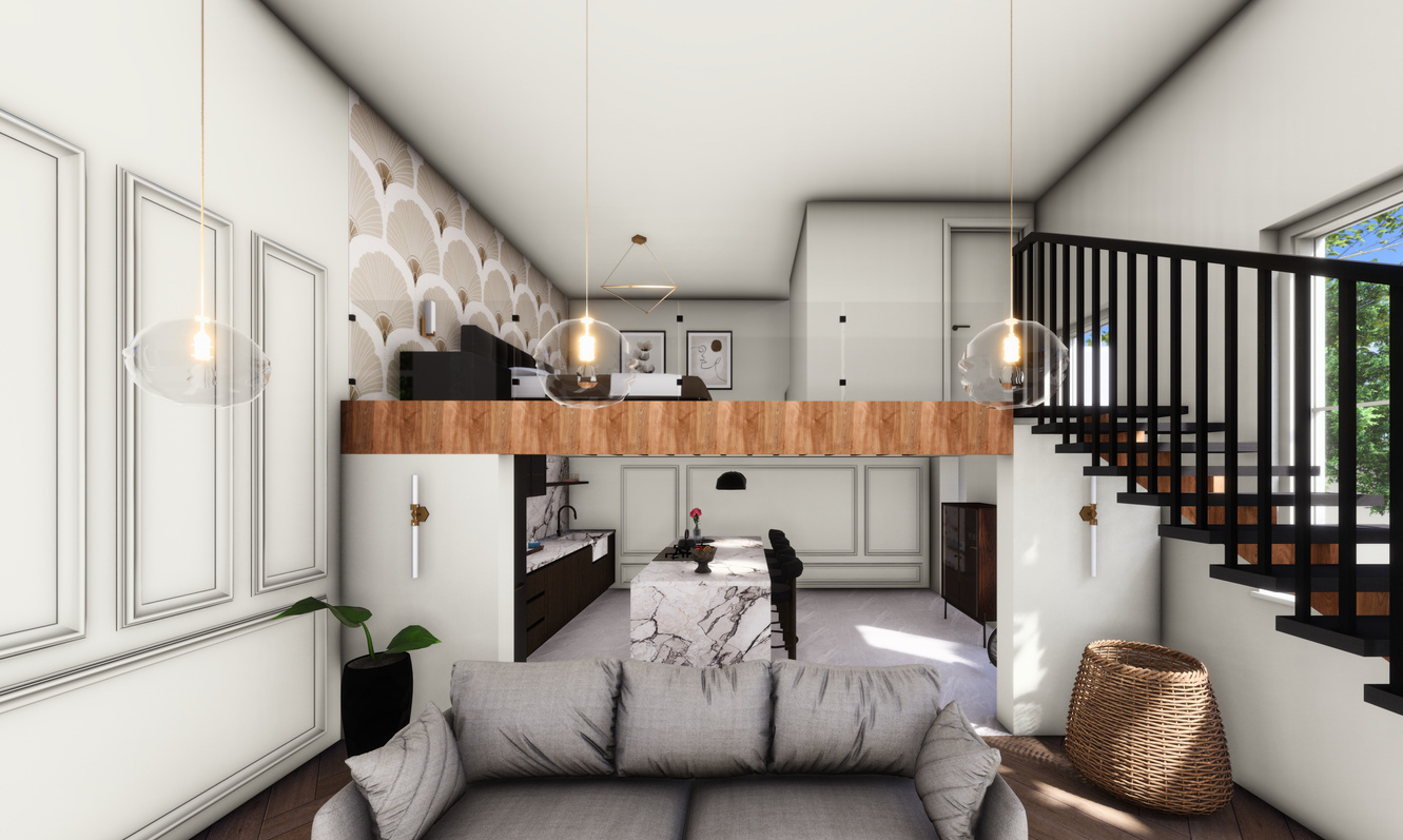
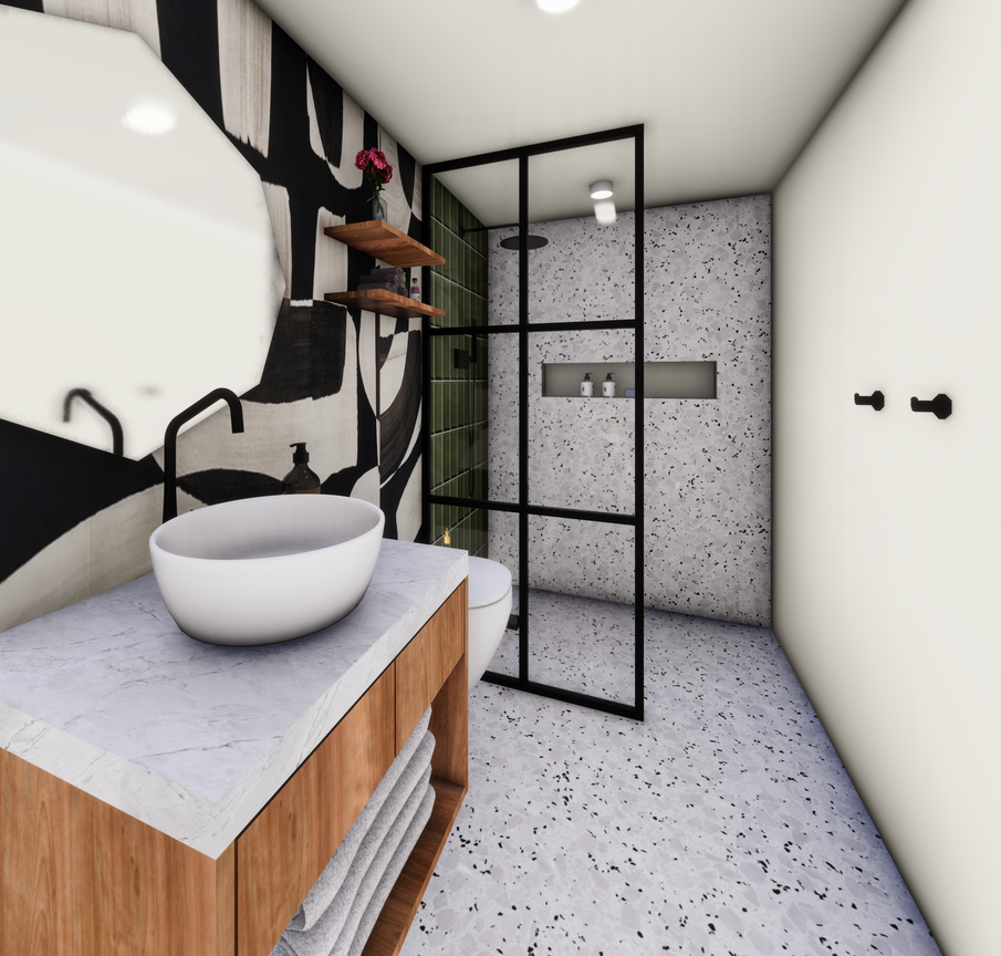
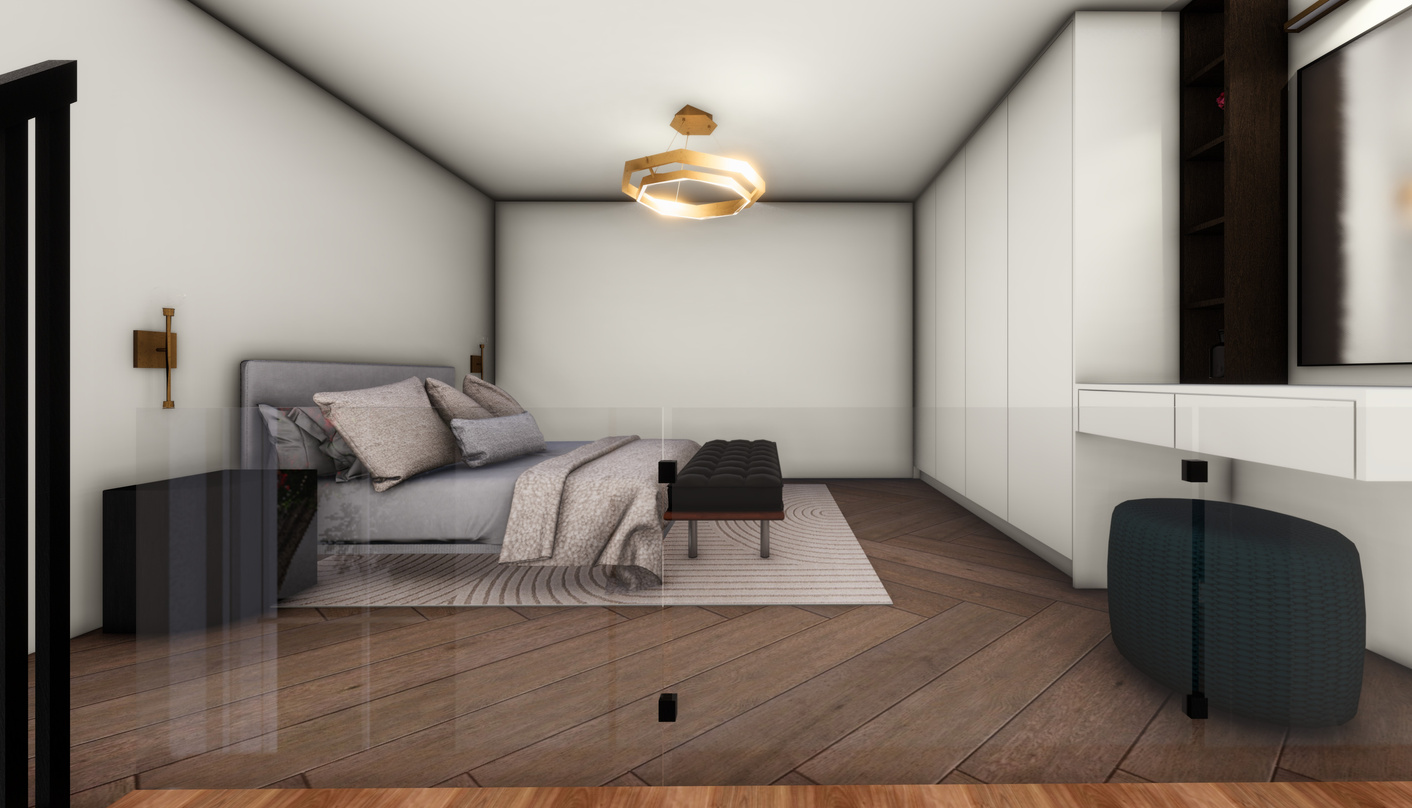
In order to solve this issue, I decided to add mezzanine floors to create a double story space. The buildings high walls made this design idea possible. Structural elements on the exterior were kept intact to preserve historical significance. The interior walls were demolished, and support beams added in place to support the second floor. Refurbished wood is used on the floor and main kitchen cabinets. Ceramic tiles were used in the bathrooms and kitchen floor. A selection of bathroom tiles was chosen for the shower in each room. Marble countertops also added a modern touch to the space.

LIVING ROOM
KITCHEN
LIVING ROOM
ENTRANCE
GROUND FLOOR
KITCHEN
BATHROOM
BATHROOM
KITCHEN
BEDROOM
BEDROOM
BATHROOM
FIRST FLOOR
BEDROOM
Dating back to the Boer War in the first decade of the 20th Century. The train station was a stop for British shoulders transiting from Durban though the Midland battlefields as well as returning wounded soldiers. This train line is no longer in use and is only used by the Umgeni Steam Railway which runs a tourist service every month.
LIVING ROOM
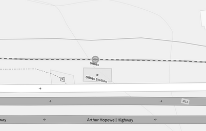

M13 Arthur Hopewell, Chelmsfordville, Gillits, 3610
BATHROOM
08
MAIN RESIDENCE - LIVING ROOM
MAIN RESIDENCE - KITCHEN
AIR BNB - BATHROOM
MAIN RESIDENCE
MAIN RESIDENCE - KITCHEN
MAIN RESIDENCE - BATHROOM
AIR BNB - BEDROOM
AIR BNB
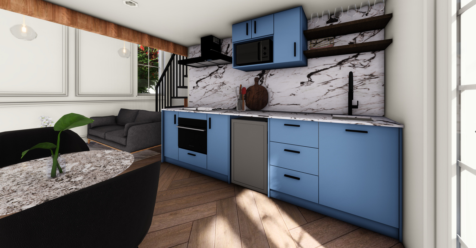
AIR BNB - KITCHEN
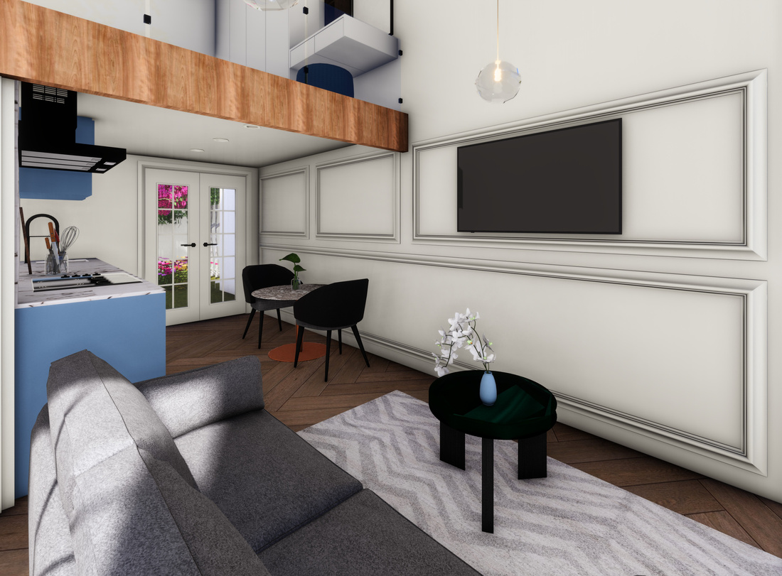
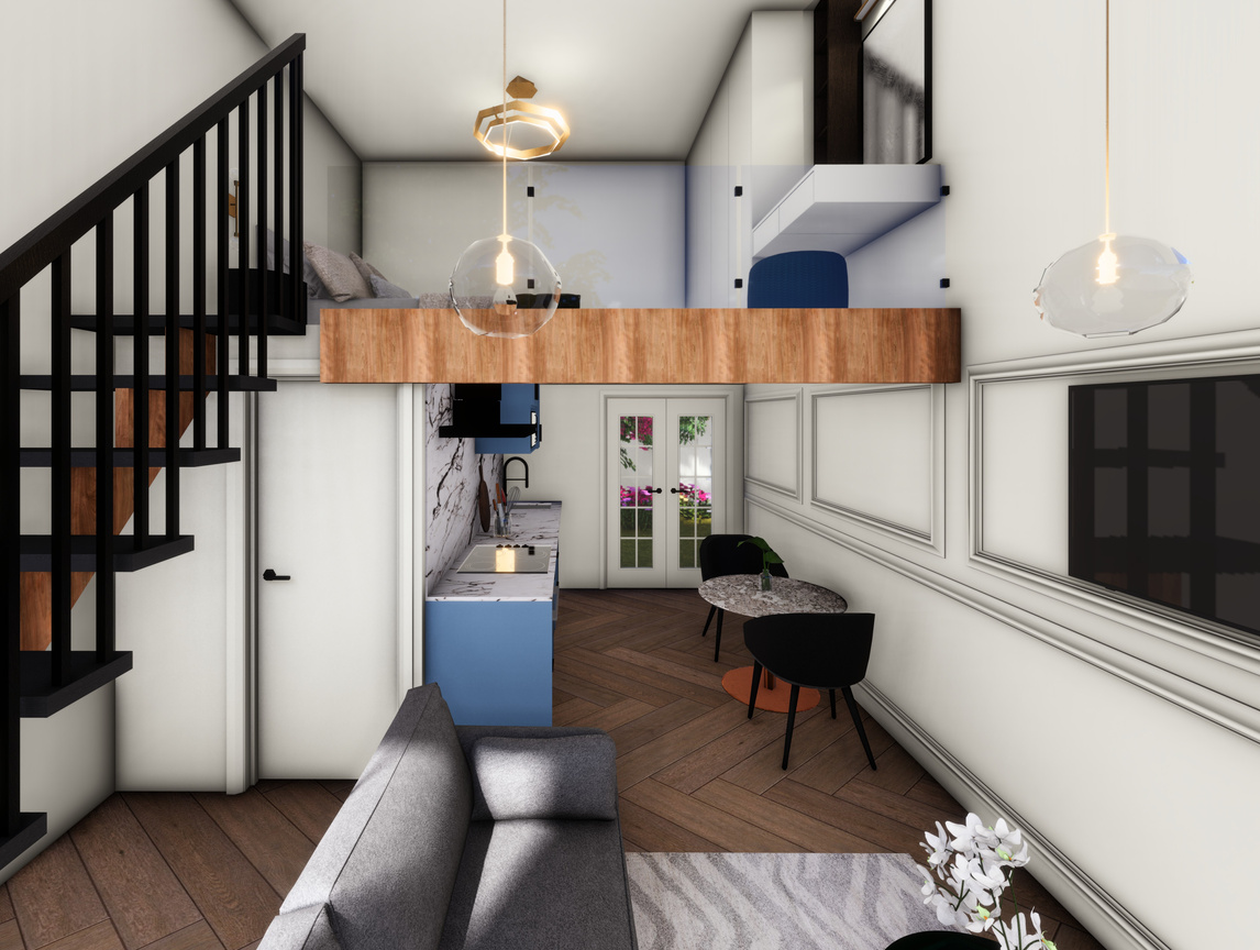
AIR BNB - LIVING ROOM
AIR BNB
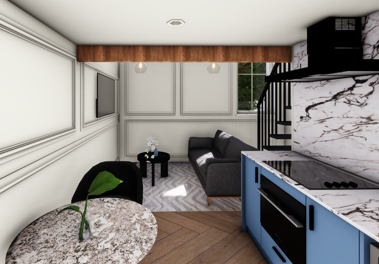
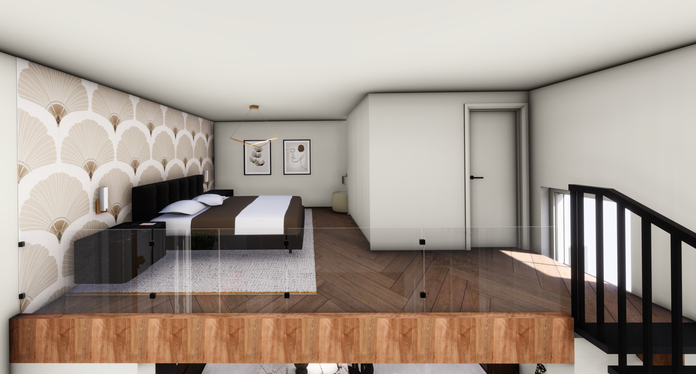
The homes were designed in a Art deco aesthetic. Features of this architecture style include wall mouldings which was added to the rooms as well as black accessories. The interior space was reconfigured to accommodate contemporary needs and lifestyles. This included functional layouts such as open floor plans and flexible spaces. The main space contains an open plan lounge area for entertainment as well as a large kitchen and entrance space.
The Airbnb rooms were designed with a hotel layout in mind. I wanted each guest to have plenty of space to eat, sleep and socialize. This was done by added that second floor as the bedroom. It was designed to replicate a loft. Finishes were kept consistent throughout the entire building design, however the kitchen backsplash, counters and bathrooms were changed to make the spaces look unique and different.
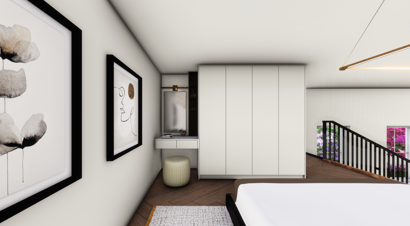
MAIN RESIDENCE - BEDROOM
09
MAIN RESIDENCE - BEDROOM
Hello, I’m
zakiyya soomra
About Me
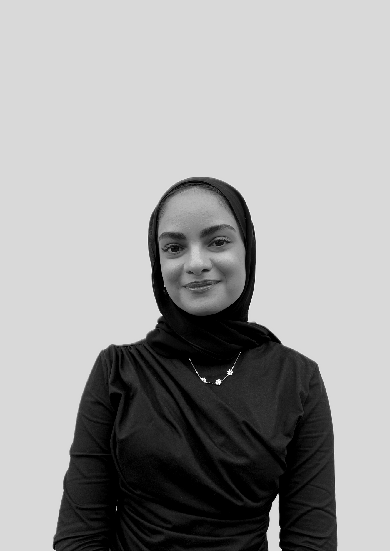
I am currently 23 years old and a 3rd year student at IIE Vega Cape Town with a passion for creating beautiful and functional spaces.
I believe that a good design is more than just aesthetics; it's about creating environments that enhance our lives. I approach each project with a blend of creativity, expertise, and a deep understanding of design principles. My design philosophy is rooted in the idea that every space should tell a story—a story that reflects the personality and lifestyle of its inhabitants. It highlights the commitment to creating personalized and timeless spaces that blend functionality with aesthetics.
